Explore the colors: A Journey into the World of Color Theory and Perception

Embark on an adventure filled with surprises as we delve into the fascinating world of colors and their profound impact on our lives.
Colors: a language of emotions
Colors possess an incredible power to evoke emotions, influence our thoughts, and shape our experiences. Artists harness the expressive power of colors to convey their feelings and ideas, while marketers strategically utilize them to establish brand identities and attract customers. Even animals employ colors for communication, using them to signal danger, attract mates, or camouflage themselves.
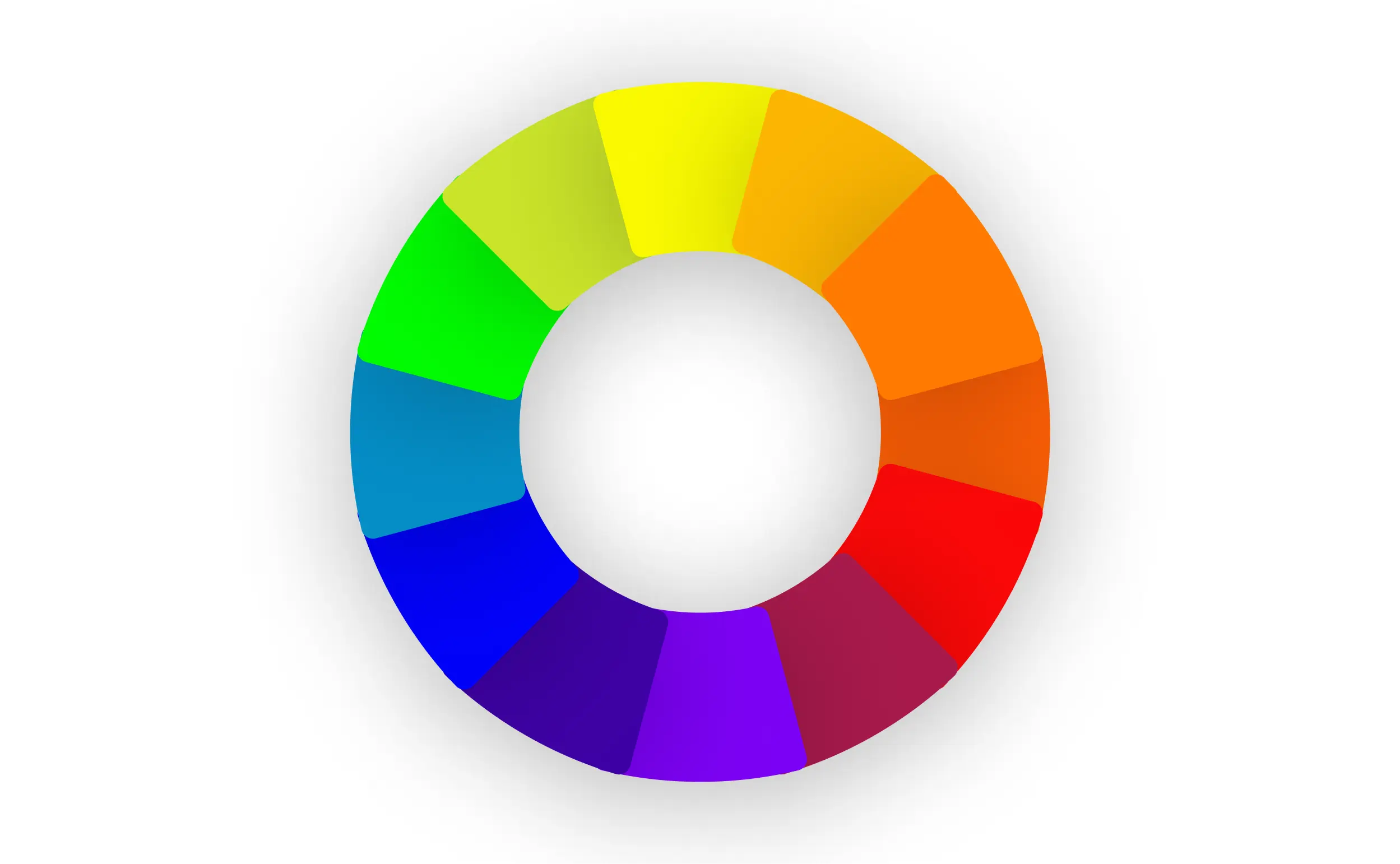
Do you know the color wheel? The color wheel serves as an indispensable tool for designers and artists, providing a visual representation of the relationships between colors. At the heart of the color wheel lie the three primary colors: red, blue, and yellow. By mixing these primary colors in various proportions, we create the secondary colors: orange, green, and purple. These secondary colors, along with the primary colors, form the foundation of our color palette.

Complementary colors: a dance of contrasts
Complementary colors are those that reside opposite each other on the color wheel. When placed side by side, they create a striking contrast, generating a sense of energy and vibrancy. This dynamic interplay of complementary colors is often employed in art, design, and fashion to add visual interest and emphasize certain elements.
Now, let's put our color theory knowledge into practice! Gather your primary colors – red, blue, and yellow – and embark on a color-mixing adventure. Experiment by combining different proportions of these colors to create the secondary colors. Observe the resulting hues and how they change depending on the ratios used.
The Intriguing Duo: Black and White
While black and white are often perceived as the absence of color, they hold a unique and significant role in the world of color theory. Some consider them to represent the extremes of the color spectrum, with white symbolizing the presence of all colors and black representing their absence. This concept is beautifully illustrated in the phenomenon of the rainbow, where sunlight refracts through raindrops, splitting into its constituent colors.
Black and White's Impact on Color Perception
Black and white possess the remarkable ability to alter the perception of other colors. To explore this phenomenon, gather some white paper, a black marker, and a selection of colored crayons. Draw various shapes or circles on the white paper using the black marker. Next, choose a crayon color and fill in the shapes, leaving a small border of white around each one.
Observe how the white space surrounding the colored shapes influences their appearance. Experiment with different colors and notice how the contrast between the colored areas and the white background affects your perception of the colors.

The challenge: colors and emotions
Now, it's your turn to delve into the emotional realm of colors. Take some time to reflect on how different colors evoke specific emotions within you. What feelings do red, blue, green, or yellow typically elicit?
Recall a moment when you experienced intense happiness, surprise, sadness, or fear. Can you create a drawing or painting that captures the essence of that emotion? Unleash your creativity and share your masterpiece with us!
The world of colors is a vast and captivating realm, filled with endless possibilities for exploration and expression. As we continue to delve into the intricacies of color theory and perception, we gain a deeper understanding of the profound impact colors have on our lives.
Engage with the video lesson
Discover a wide range of art and design techniques through our interactive and educational videos. From sketching and painting to sculpture and digital art, our lessons will inspire and empower young minds to unleash their creativity. Start your artistic journey today!